Thursday, June 16, 2011

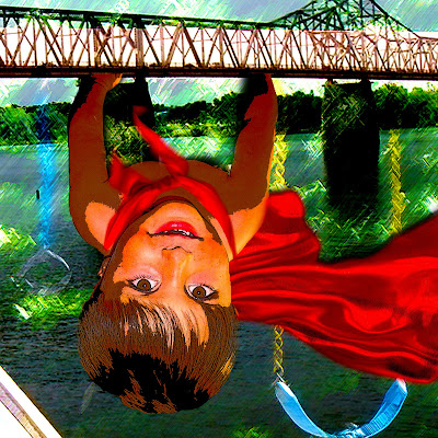
Super Stoutt!


Week 6: Final

As my last project I wanted to do something fun with Photoshop. I really have enjoyed the last 6 weeks and loved learning and using my imagination to play with my own photos. This last project came from the idea I had from one of the young children I was babysitting for. He was jumping around the room pretending he was Batman and that is when I thought of a child superhero. The pieces tell the story of Super Stoutt and how the city has become his playground. He loves his toys and games but in order to continue playing he must keep them all safe. Whether the villain is the spilled chocolate milk or the dangerous Lego Bridge, Super Stoutt is there to save the day. The pieces consisted of using Quick Selection Tool to separate the background from Stoutt, Brush Tool for creating a brighter cape and play set, Healing Tool to fix the imperfections, and the Eraser Tool to smooth the edges.  I wanted to give the pieces a more animated feel therefore I used the filter to distort the image and change the brush strokes. I also used the different blending techniques to pull the layers together for the “playful” backdrop and even used the blending layer to give a more windblown, fabric feel. The adjustments were made to the color balance and the vibrancy of the pieces. Over all these last few weeks I have really enjoyed using my imagination for this artwork. I love to paint but over the years I have not had as much time to be creative and by taking this class I have been able to do what I adore.

Thursday, June 9, 2011

Fortuna


Week 5: Fortuna

When we received this lesson my first thought was of the song "Desperado" by The Eagles and the lyrics "Don't you draw the Queen of Diamonds boy, she'll beat you if she's able. You know the Queen of Hearts is always your best bet." I wanted to convey the idea of "Lady Luck" being the Queen of Hearts and the idea of taking a chance on love. With this piece I used the filter tool to create a varied backdrop for the game table and the hearts. I also used the paint tool to give the statue of the Goddess Fortuna to give her the look of the Queen of Hearts. I added the text and blended it with the soft light. I scanned the four queens to add the idea of playing a game and winning "love". In the second piece I thought of the song "Turn of a Friendly Card" by The Alan Parson's Project thus adding the Ace in the sleeve but I also wanted to convey the idea of timing when playing high stake games like poker. With this piece I had scanned the pocket watch and found antique cards and a clock to give the layers an older look. Poker is a timeless game that can be fun or can be highly intriguing. The layers are darkened but the filter was only used on the hand with the Ace and the pocket watch. The pocket watch is an overlay on the cards and the hand was made to look more antique by placing a parchment background as the overlay. This project was so far my favorite because of the freedom we had to produce whatever made us think of fortune and luck.

Thursday, June 2, 2011

Surrealism at My Finest


Week 4: Surreal Landscape

I am really enjoying Photoshop at this point! However now I have trouble coming up with ideas for my pieces. These two pieces came from the idea that God is creating beauty all around us. In the first piece I used the blending techniques to create a brighter side and a darker side to give the feel of day to night. I duplicated the scroll image and flipped it to create the two sides of the scroll. I used the merge tool to combine all the layers so I was able to give the feel of old paper. In order to give the scroll an older feel I also used the burn tool. Originally I had the background white but it felt too bright. After making it black the contrast really made the piece pop out. In the second piece I replaced the color to give the stark difference between the sky and the ground. The footprints are my favorite part! With that layer I duplicated the image and warped it to fit the path. I used a lot of retouching because of the amount of excess stuff on the landscape that took away from the simple concept. I used different blending techniques like overlay and vivid light to enhance the lighting on the piece. I changed the hue and saturation of the hand to blend it more into the sky. Overall I felt this project was interesting to put together because of the surreal concept, and in order to fully understand it I looked at the amazing the paintings of Salvador Dali. His artwork really gave me ideas on how to incorporate the dream world with the real world.